
Top Project Tracking Metrics to Boost Your Success
Discover key project tracking metrics to improve visibility and delivery. Learn how these metrics optimize project outcomes effectively.

Unlocking Project Success with Powerful Metrics
Want to keep projects on track and deliver exceptional results? This listicle reveals eight essential project tracking metrics to boost your project management prowess. Learn how Earned Value Management (EVM), burndown charts, velocity, cycle time, sprint burnup charts, Cumulative Flow Diagrams (CFDs), defect density, and risk exposure metrics provide valuable insights. Mastering these project tracking metrics empowers data-driven decisions, optimized workflows, and ultimately, project success.
1. Earned Value Management (EVM)
Earned Value Management (EVM) is a powerful project tracking metric that goes beyond simply monitoring deadlines and budgets. It provides a systematic approach to measuring project performance against a baseline plan by integrating scope, schedule, and cost data. This allows project managers to objectively assess how much value has been earned compared to what was planned and actually spent, offering crucial insights into project health and potential issues. EVM helps answer critical questions like: Are we on track to finish on time and within budget? Is the project delivering the expected value? This makes it a crucial metric for effective project tracking and control, deserving its top spot on any list of essential project tracking metrics.
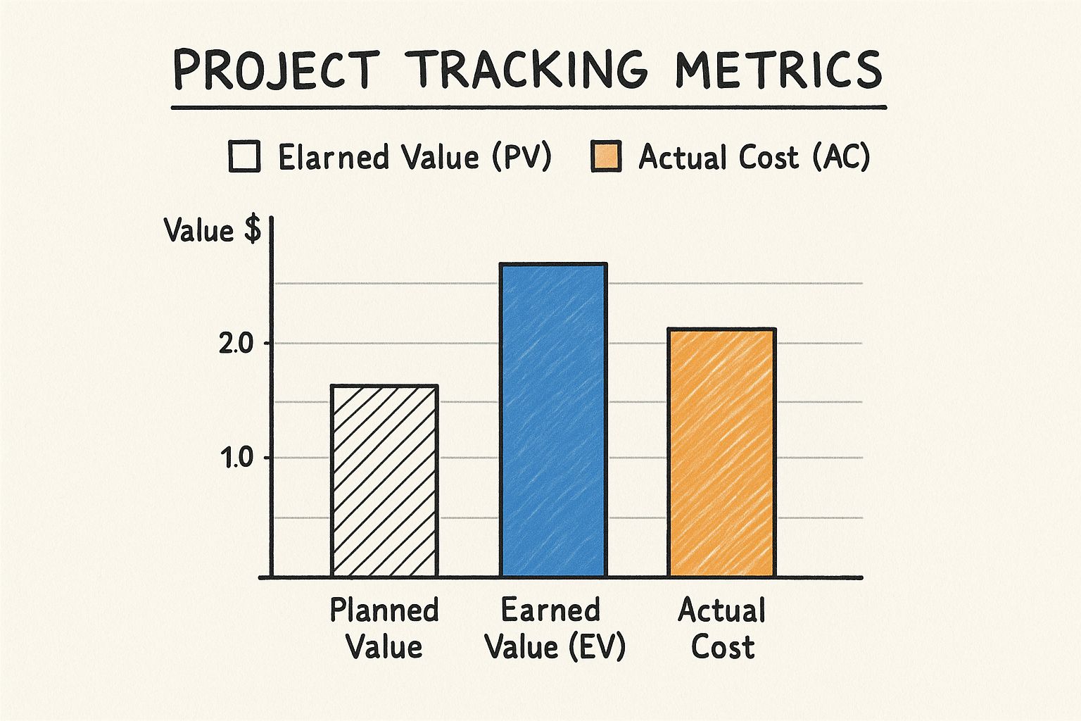
This infographic visually represents the core components of EVM. It showcases the relationship between Planned Value (PV), Earned Value (EV), and Actual Cost (AC). For example, if a project is scheduled to be 50% complete with a planned value of $50,000, but only 40% of the work is actually completed (representing an earned value of $40,000), and the actual cost incurred is $60,000, the infographic would visually demonstrate this deviation from the plan, highlighting a cost overrun and schedule delay. This visualization makes it easy to grasp the project's current state and potential issues.
EVM leverages three key metrics: Planned Value (PV), Earned Value (EV), and Actual Cost (AC). PV represents the budgeted cost of work scheduled, EV represents the budgeted cost of work actually completed, and AC represents the actual cost incurred for the work performed. By comparing these metrics, EVM calculates key performance indicators like Schedule Variance (SV = EV - PV) and Cost Variance (CV = EV - AC), providing valuable insights into project progress and potential problems. These variances, expressed in monetary terms, quantify how far ahead or behind schedule and over or under budget the project is. This quantitative approach helps move beyond subjective assessments, allowing for data-driven decision making.
Features and Benefits:
- Integrated Methodology: EVM measures cost, schedule, and scope performance with a single integrated methodology.
- Early Warning Signals: Provides early warning signals for performance issues, allowing for timely corrective actions.
- Forecasting: Calculates forecasts for project completion dates and final costs.
- Objective Measurement: Provides an objective measurement of project progress based on data.
- Data-Driven Decision Making: Supports data-driven decision making by providing quantifiable performance indicators.
Pros and Cons:
Pros:
- Provides objective measurement of project progress.
- Enables early identification of trends and problems.
- Helps forecast future performance based on historical data.
- Supports data-driven decision making.
- Standardized methodology recognized globally.
Cons:
- Complex implementation requiring training and expertise.
- Can be administratively burdensome for small projects.
- Quality is not directly measured.
- Requires regular and accurate data collection to be effective.
- Initial setup can be time-consuming.
Examples of Successful Implementation:
- Defense and aerospace projects by the U.S. Department of Defense.
- NASA's space programs.
- Large infrastructure projects like the Channel Tunnel.
- IT implementation projects at companies like Boeing and Lockheed Martin.
Tips for Effective Implementation:
- Start Small: Start with simplified EVM metrics on smaller projects before scaling up.
- Integrate Data Collection: Integrate EVM data collection into regular project processes.
- Train Your Team: Train team members on EVM principles for better adoption.
- Use EVM Software: Use EVM software tools rather than manual calculations.
- Regular Review: Review EVM metrics weekly to catch variances early.
When and Why to Use EVM:
EVM is particularly valuable for projects with defined scopes, schedules, and budgets. It's especially useful for complex projects where traditional project tracking methods may not provide sufficient insight into overall performance. Whether you're managing a large-scale IT implementation or a smaller project within Google Workspace, EVM can provide valuable insights to keep your projects on track and deliver the expected value. While the initial setup might require some effort, the benefits of early problem detection, accurate forecasting, and data-driven decision-making make EVM a valuable tool for any project manager.
2. Burndown Charts
Burndown charts are essential project tracking metrics that provide a visual representation of the work remaining against a timeline. They plot the remaining work (e.g., story points, task hours, or number of requirements) on the vertical axis (y-axis) against time on the horizontal axis (x-axis). This allows teams to quickly grasp the rate at which tasks are being completed and how much work is left, ultimately visualizing their progress toward project completion within the defined timeframe. This makes burndown charts particularly valuable for project managers and team leads seeking to monitor project health and maintain momentum.
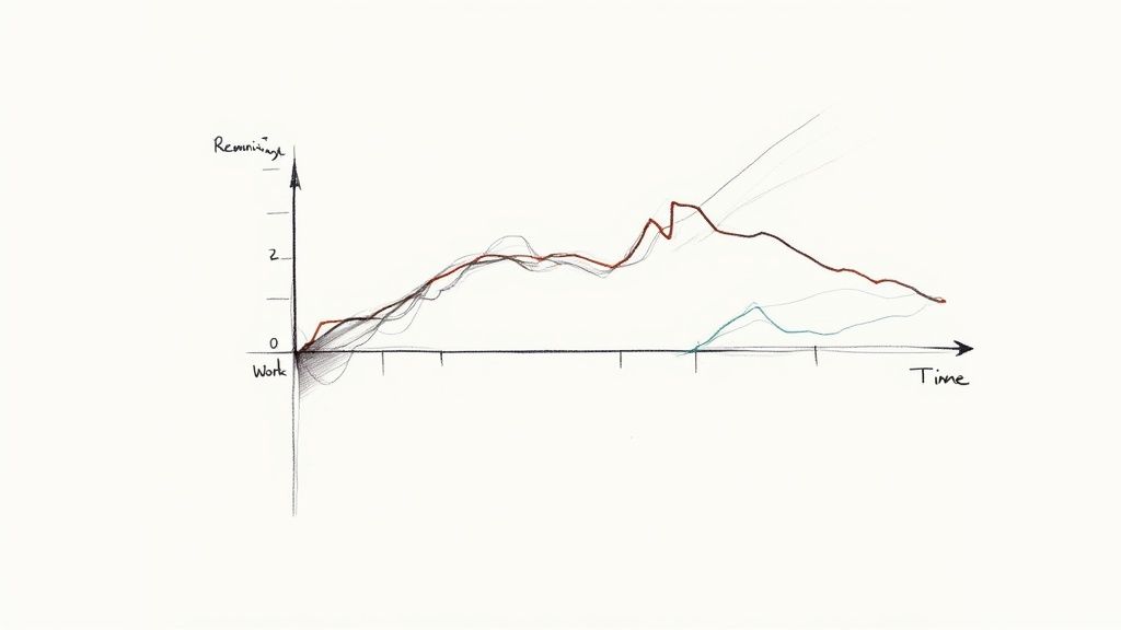
A key feature of burndown charts is the "ideal burndown line," which represents the planned rate of work completion. Comparing the actual progress line against the ideal line instantly reveals whether a project is ahead of, behind, or on schedule. This visual feedback facilitates timely interventions and adjustments, a crucial aspect of successful project management. While frequently employed in Agile methodologies like Scrum, the simplicity and adaptability of burndown charts make them suitable for diverse project management approaches, including Kanban-style workflows. You can learn more about Burndown Charts and their application in different contexts. This resource is particularly useful for non-technical teams looking to simplify project tracking.
Companies like Spotify, Microsoft, Atlassian, and IBM utilize burndown charts for effective project tracking. For instance, Spotify’s agile engineering teams leverage them for sprint management, while Microsoft uses them within Azure DevOps to track development progress. This widespread adoption underscores the effectiveness of burndown charts as a project tracking metric.
Pros:
- Simple and understandable: Burndown charts are easy to create and interpret, promoting quick comprehension across team members and stakeholders.
- Immediate visual feedback: The chart's visual nature offers an at-a-glance understanding of project status, facilitating rapid decision-making.
- Schedule adherence: Burndown charts help identify schedule deviations, enabling proactive adjustments to maintain project timelines.
- Enhanced transparency: They foster transparency by providing a shared view of progress, promoting accountability and collaboration.
Cons:
- Limited scope: Burndown charts primarily focus on task completion and don't reflect the quality or value of the work delivered.
- Potential for masking issues: Relying solely on burndown charts can obscure underlying problems if not combined with other project tracking metrics.
- Risk of rushing: The focus on matching the ideal line might encourage teams to rush tasks, potentially compromising quality.
- Inflexibility with scope changes: Traditional burndown charts don't readily adapt to changes in project scope or shifting priorities.
Tips for Effective Use:
- Daily updates: Update the chart daily, ideally during daily stand-up meetings, to ensure accuracy and relevance.
- Consistent units: Maintain consistent units of measurement (e.g., story points, hours) throughout the project for reliable tracking.
- Pattern analysis: Analyze trends and patterns in the chart to identify recurring issues and areas for improvement.
- Consider burnup charts: For projects with frequent scope changes, complement burndown charts with burnup charts, which visualize the work completed and added over time.
- Trend line forecasting: Include a trend line to project the likely completion date based on the current velocity.
Burndown charts deserve a prominent place in the list of project tracking metrics due to their simplicity, visual clarity, and effectiveness in monitoring progress and managing timelines. They are particularly beneficial for small and medium-sized businesses, sales teams, and individual professionals seeking a readily understandable and actionable tool for tracking project health. For Google Workspace users, integrating burndown charts into existing workflows can significantly enhance project visibility and control, aligning with the needs of both individual users and administrative teams seeking productivity improvements.
3. Velocity
Velocity, a crucial project tracking metric within agile methodologies, helps teams understand their pace of work and predict future output. It measures the amount of work a team completes during a sprint (a short, time-boxed iteration), providing valuable insights for planning and resource allocation. This makes it an essential metric for project managers and team leads, particularly those working in fast-paced environments and using frameworks like Scrum. It's especially beneficial for teams using Google Workspace, as it complements the collaborative nature of the platform and helps optimize workflows.
How Velocity Works:
Velocity is calculated by summing the completed "units" of work within a sprint. These units can vary but are commonly represented as story points (a relative measure of effort) or actual work hours. By tracking velocity over multiple sprints, teams establish a baseline that reflects their sustainable pace. This historical data then becomes a cornerstone for estimating how much work can realistically be accomplished in future sprints.
Features and Benefits:
- Measures Team Productivity Over Time: Velocity provides a trendline of team output, allowing for observation of improvements or impediments.
- Predictive Planning: By understanding their average velocity, teams can make more realistic commitments and improve sprint planning accuracy.
- Capacity Planning: Velocity helps gauge team capacity, allowing for better resource planning and allocation. This is particularly useful for project managers within Google Workspace, facilitating optimal task distribution across team members.
- Continuous Improvement Benchmark: Tracking velocity facilitates continuous improvement by highlighting areas for optimization in the team's workflow.
- Simplified Project Completion Forecasting: A consistent velocity allows for more accurate predictions of project completion dates.
Pros:
- Realistic Commitments: Historical velocity data enables teams to make data-driven commitments, minimizing the risk of overcommitment or underestimation.
- Improved Sprint Planning: Accurate velocity tracking enhances sprint planning and reduces the likelihood of mid-sprint adjustments.
- Benchmark for Improvement: Velocity provides a clear metric for tracking team progress and identifying opportunities for improvement.
- Streamlined Resource Allocation: Knowing the team's capacity simplifies resource allocation and prevents bottlenecks.
- Predictable Project Timelines: Consistent velocity data helps predict project completion dates with greater accuracy.
Cons:
- Potential for Misuse as a Performance Metric: Velocity should not be used to evaluate individual team member performance, as it reflects team capacity. Focusing on velocity as a performance metric can lead to unhealthy competition and inaccurate data.
- Early Stage Fluctuations: Velocity can be unstable during the initial stages of a project and requires several sprints to stabilize.
- Susceptibility to Manipulation: If team members feel pressured to artificially inflate velocity, the metric loses its accuracy and usefulness.
- Lack of Inter-Team Comparability: Comparing velocities across different teams is misleading, as various factors influence each team’s pace.
- Doesn't Reflect Quality: Velocity focuses on quantity, not quality, and doesn't account for the business value delivered.
Examples of Successful Implementation:
- Salesforce: Development teams at Salesforce leverage velocity to plan product releases and manage their agile development cycles.
- Google: Google's engineering teams utilize velocity tracking within their agile processes to improve predictability and manage complex projects.
- Scaled Agile Framework (SAFe): SAFe implementations employ velocity for program increment planning and coordinating multiple agile teams.
- Spotify: Spotify's autonomous "squads" use velocity to improve their predictability and optimize their work processes.
Actionable Tips:
- Rolling Average: Calculate velocity using a rolling average of the last 3-4 sprints to smooth out fluctuations and gain a more stable metric.
- Team Focus: Emphasize team velocity, not individual performance, to foster collaboration and avoid unhealthy competition.
- Avoid Inter-Team Comparisons: Refrain from comparing velocities between different teams, as their contexts and working styles vary.
- Account for Availability: Consider team member availability and planned absences when using velocity for sprint planning.
- Planning Tool, Not Performance Metric: Use velocity as a planning tool to improve forecasting and resource allocation, not as a metric for performance evaluation.
Why Velocity Deserves its Place in the List:
Velocity offers a powerful way to understand and predict a team's work capacity within agile project management. Its focus on data-driven planning and continuous improvement aligns perfectly with the needs of modern project managers and team leads, especially those utilizing platforms like Google Workspace. By understanding and applying velocity effectively, teams can significantly enhance their predictability, improve resource allocation, and achieve more consistent project delivery.
4. Cycle Time
Cycle time is a crucial project tracking metric that measures the total time it takes for a work item to move from the beginning stage to completion. This metric provides valuable insights into the speed of your workflow and the efficiency of your processes, enabling you to pinpoint bottlenecks and optimize your delivery pipeline. As a project manager or team lead, understanding and effectively utilizing cycle time can significantly improve your team's productivity and project outcomes, making it a vital component of any successful project tracking strategy. This is particularly relevant for those using Google Workspace, seeking unified task and project management, or even individuals managing tasks within Gmail.
Cycle time essentially measures the elapsed time from the moment work begins on an item until it's fully completed and ready for delivery. It's typically measured in days or hours and can be applied to individual tasks, larger features, or even entire projects. This flexibility allows for granular analysis of your team's performance and helps identify specific areas for improvement. Learn more about Cycle Time and how it fits within broader project planning methodologies.
Often visualized through control charts showing trends over time, cycle time is a key component of Lean and Kanban methodologies, focusing on optimizing workflow and minimizing waste. By monitoring cycle time, you gain a clear understanding of your team's velocity and identify any roadblocks hindering efficient delivery. For instance, if a particular stage in your software development lifecycle consistently exhibits a longer cycle time, you can investigate the underlying causes and implement targeted solutions.
Features and Benefits of Tracking Cycle Time:
- Measures elapsed time: Provides a clear measure of the actual time spent on work items.
- Applicable at various levels: Can be used for individual tasks, features, or entire projects.
- Visualizable: Track trends and patterns through control charts.
- Predictive capability: Supports more predictable delivery through statistical analysis.
- Directly reflects process efficiency: Clearly shows how efficiently work flows through your system.
- Bottleneck identification: Helps pinpoint specific stages causing delays.
- Actionable data: Provides data-driven insights for process improvement.
- Stable metric: More stable than velocity, especially for teams handling variable work item sizes.
Pros and Cons:
- Pros: Directly reflects process efficiency and flow, helps identify bottlenecks, provides actionable data for process improvement, more stable than velocity for teams with variable work item sizes, supports predictable delivery.
- Cons: Doesn't account for work item complexity or size differences, may require mature tracking systems for accurate measurement, can be skewed by outliers or exceptions, doesn't directly measure value delivered, may promote rushing through work.
Examples of Successful Implementation:
- Toyota: A pioneer in using cycle time for manufacturing process optimization.
- Amazon: Development teams leverage cycle time to improve delivery speed.
- Siemens Healthcare: Reportedly reduced software development cycle time by 50% using this metric.
- Capital One: Uses cycle time metrics to enhance software delivery performance.
Actionable Tips for Using Cycle Time:
- Breakdown into sub-phases: Identify specific bottlenecks by analyzing cycle time for individual stages of your workflow.
- Set improvement targets: Focus on reducing variation in cycle time first, then aim to lower the average.
- Use percentiles: Use percentiles (e.g., 85th percentile) instead of averages for more reliable forecasting, as they are less sensitive to outliers.
- Visualize data: Employ control charts to identify trends, patterns, and anomalies in your cycle time data.
- Combine with throughput: Use cycle time in conjunction with throughput metrics for a more comprehensive understanding of productivity.
Cycle time deserves its place in the list of project tracking metrics because it offers a direct and actionable way to understand and improve process efficiency. It is particularly valuable for teams working in iterative development cycles, such as Agile and Kanban, where continuous improvement is a core principle. Whether you're a small business leveraging Google Workspace for project management, a sales team needing integrated CRM, or an individual freelancer, tracking cycle time can empower you to optimize your workflows, deliver projects faster, and achieve better overall results.
5. Sprint Burnup Charts
Sprint Burnup Charts are a powerful project tracking metric that visualizes the progress of work completed over time against the total scope. Unlike Burndown Charts, which focus on remaining work, Burnup Charts plot the accumulated completed work, offering a clearer picture of project progress, especially when dealing with evolving requirements. This makes them a valuable tool for project managers and team leads seeking effective ways to monitor and communicate project status. They are particularly relevant for those using Google Workspace, as several add-ons and integrations offer burnup chart functionality within Sheets or other Google Workspace apps.
How They Work:
Sprint Burnup Charts display two key lines:
- "Work Completed" Line: This line trends upwards, showing the cumulative amount of work finished over time. This can be tracked using various units such as story points, hours, or number of tasks.
- "Total Scope" Line: This line represents the total amount of work planned for the sprint. Crucially, this line can move if the scope changes, providing a visual record of scope adjustments.
The space between these two lines represents the remaining work. A projected completion trend line is often added, based on the current rate of progress, to forecast the likely completion date.
Why Use Sprint Burnup Charts?
Burnup Charts are especially useful when:
- Requirements are fluid: Unlike Burndown Charts, which can obscure the impact of scope changes, Burnup Charts explicitly visualize them. This transparency is essential for projects using agile methodologies and for teams working in dynamic environments where adjustments are common.
- Motivating the team: The upward trend of the completed work line provides a positive visual representation of progress, which can be more motivating than the downward trend of a Burndown Chart.
- Communicating with stakeholders: The clear visualization of scope changes and their impact on the timeline facilitates transparent communication with stakeholders. It allows for proactive discussions about adjustments and ensures everyone is on the same page.
- Maintaining a historical record: Burnup Charts provide a valuable historical record of project progress and scope adjustments, offering insights for future projects and process improvements.
Features and Benefits:
- Visualizes Scope Changes: Clearly shows how changes in scope impact the project timeline.
- Tracks Cumulative Work: Provides a clear picture of how much work has been completed.
- Flexible Tracking Units: Can track story points, hours, or number of tasks.
- Projected Completion: Often includes a trend line to forecast the completion date.
- Improved Stakeholder Communication: Facilitates transparent discussions about progress and scope.
Pros and Cons:
Pros:
- Clearly visualizes scope changes.
- Shows positive progress (motivating).
- Provides a better historical record.
- Useful for stakeholder communication.
- Works well for evolving requirements.
Cons:
- Slightly more complex to interpret than Burndown Charts.
- Requires diligent tracking of scope changes.
- Can become cluttered with multiple data series.
- May be less intuitive for teams new to agile.
Examples of Successful Implementation:
- Adobe: Uses Burnup Charts for tracking feature development across releases.
- IBM: Agile teams utilize Burnup Charts for projects with evolving requirements.
- Ericsson: Employs Burnup Charts for telecommunication system development.
- Intel: Hardware-software integration projects utilize Burnup Charts for progress tracking.
Actionable Tips:
- Color Coding: Use different colors to distinguish the completed work line from the total scope line.
- Annotations: Add annotations to explain significant scope changes on the chart.
- Trend Line: Calculate and display a trend line to forecast project completion.
- Daily Updates: Update the chart daily to provide the most current status information.
- Combined Approach: Consider using Burnup Charts alongside Burndown Charts for a comprehensive tracking approach.
Popularized By:
- Mike Cohn (Agile thought leader)
- SAFe (Scaled Agile Framework)
- Dan Rawsthorne (CST and Agile coach)
- Rally Software (now part of Broadcom)
Sprint Burnup Charts earn their place among essential project tracking metrics because they offer a transparent and visually compelling way to monitor progress, especially in dynamic environments with changing requirements. This makes them a crucial tool for project managers seeking to maintain control, improve communication, and ultimately deliver successful projects. Their ability to highlight scope adjustments makes them particularly valuable for teams practicing agile methodologies and those working within the flexible framework of Google Workspace.
6. Cumulative Flow Diagram (CFD)
A Cumulative Flow Diagram (CFD) is a powerful project tracking metric that visualizes the flow of work items through various stages of a project over time. It's essentially a stacked area chart where each band represents a different stage in your workflow (e.g., To Do, In Progress, Testing, Done). The horizontal axis represents time, while the vertical axis represents the number of work items. By analyzing the width of each band and how it changes over time, project managers can gain valuable insights into bottlenecks, delays, and overall process efficiency. This makes it an essential project tracking metric for understanding and optimizing workflow.
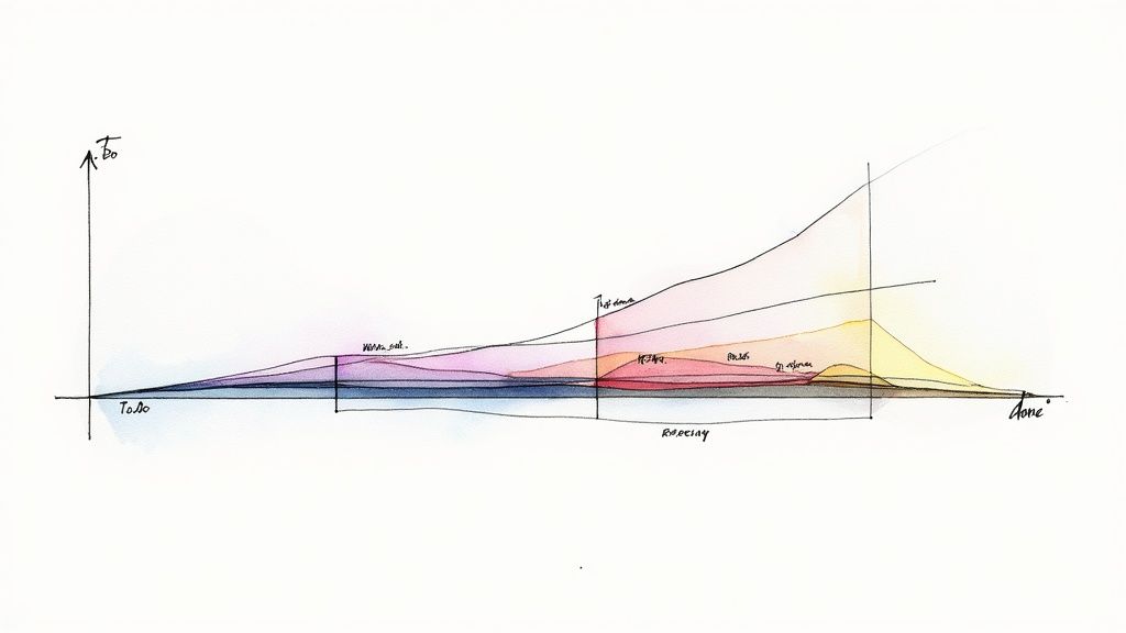
The CFD provides a visual representation of work in progress (WIP) at each stage. A widening band indicates a growing backlog of tasks at that specific stage, signaling a potential bottleneck. Conversely, a narrowing band suggests that work is flowing smoothly through that stage. The slope of the "Done" band provides a clear indication of the team's throughput, or the rate at which they complete work items. Monitoring the total height of the diagram also allows you to track scope changes over the project's lifecycle. This information is critical for making informed decisions about resource allocation, process improvements, and project timelines.
Examples of Successful Implementation:
Large organizations and small teams alike have successfully implemented CFDs to improve their project tracking and workflow management. Companies like Siemens, Ericsson, Boeing, and Verizon have all used CFDs to track progress, identify bottlenecks, and optimize their processes across various projects, from software development to telecommunications and aircraft component development. This demonstrates the versatility and applicability of CFDs across diverse industries and project types.
Actionable Tips for Using CFDs:
- Maintain Consistency: Keep your workflow states consistent throughout the project to ensure the reliability and comparability of the data displayed on the CFD.
- Identify Bottlenecks: Look for widening bands within the CFD. These are clear indicators of bottlenecks where work is accumulating and hindering progress.
- Analyze Throughput: The slope of the "Done" band reflects your team's throughput. A steeper slope indicates higher throughput, while a flatter slope suggests lower throughput.
- Track Scope Changes: Monitor the total height of the CFD. An increasing height suggests expanding scope, which may require adjustments to timelines and resources.
- Regular Updates: Update the CFD daily or at regular intervals for the most accurate and up-to-date insights into your project's progress and workflow health.
When and Why to Use a CFD:
CFDs are particularly valuable for projects using Kanban and other flow-based methodologies. They are excellent for visually representing the flow of work and identifying bottlenecks within a process. If your team is struggling with unpredictable delivery timelines, inconsistent throughput, or difficulty managing WIP, a CFD can provide invaluable insights to address these challenges. It’s a crucial project tracking metric for teams seeking continuous process improvement.
Pros and Cons of Using a CFD:
Pros:
- Visualizes workflow health at a glance
- Identifies bottlenecks and constraints
- Shows trends in throughput and cycle time
- Provides early warning of delivery risks
- Supports continuous process improvement
Cons:
- Requires consistent tracking across all workflow states
- Can be difficult to interpret without proper training
- May become complex with too many workflow states
- Needs regular data collection to be useful
- Less effective for highly variable or unpredictable workflows
This visualization method deserves its place on this list of project tracking metrics due to its ability to provide a holistic view of workflow health and identify potential roadblocks. By understanding the information a CFD presents, project managers and team leads can make data-driven decisions to optimize their workflows and achieve project success.
7. Defect Density
Defect density is a crucial project tracking metric that provides insights into the quality of your software or product development. It measures the number of confirmed defects found per unit size, which is typically per thousand lines of code (KLOC) or per feature. By tracking defect density, teams can assess the quality of deliverables, compare quality across different modules or projects, and monitor quality improvement over time. This metric provides a quantifiable measure of software quality, enabling data-driven decisions to improve the development process and ultimately, the final product. This makes it a valuable addition to your repertoire of project tracking metrics.
Defect density is calculated by dividing the total number of confirmed defects by the size of the software. For instance, if a project with 10,000 lines of code has 50 confirmed defects, the defect density is 5 defects per KLOC. This can then be tracked throughout the project lifecycle, offering valuable insights into the effectiveness of testing and development processes. It can also be segmented further by defect severity (critical, major, minor) to prioritize critical issues and allocate resources efficiently.
Features and Benefits:
- Quantifiable Quality Measurement: Provides an objective measure of software quality, facilitating data-driven decision-making.
- Comparative Analysis: Enables comparisons of quality between different modules, projects, or even different development teams.
- Trend Analysis: Tracks quality trends over time, showing the effectiveness of quality improvement initiatives.
- Problem Area Identification: Helps pinpoint problematic areas or components within the software that require attention.
- Predictive Capabilities: Can help predict potential maintenance costs and technical debt associated with poor quality code.
Pros:
- Objective quality measurement
- Identifies problematic areas/components
- Enables comparison between modules/projects
- Supports data-driven quality improvement
- Can predict maintenance costs and technical debt
Cons:
- Lines of code (LOC) can be an imperfect measure of software complexity.
- May incentivize verbose coding to artificially lower density.
- Doesn't always account for defect impact or user experience.
- Requires consistent defect logging practices for accuracy.
- Baseline densities can vary across different technologies.
Examples of Successful Implementation:
Major organizations like Microsoft utilize defect density to compare the quality across their diverse product suite. High-reliability organizations, such as NASA, adhere to stringent defect density thresholds (often less than 0.1 defects per KLOC) for their software development projects. Similarly, companies like Cisco and Oracle track defect density across their respective product development to identify high-risk components and ensure consistent quality.
Actionable Tips:
- Establish Baselines: Before setting improvement targets, measure current defect density to establish a baseline for comparison.
- Segment by Severity: Focus on critical defects by segmenting defect density based on severity levels (e.g., critical, major, minor).
- Combine with Other Metrics: Combine defect density with other metrics, such as customer-reported defects, for a more balanced view of quality.
- Consistent Counting Methods: Use consistent defect counting methods across different projects to ensure valid comparisons.
- Consider Function Points: For a more accurate measure of complexity, consider using function points as an alternative to lines of code.
Maintaining a low defect density is crucial for software quality. Implementing robust testing strategies, along with other software quality assurance best practices can help you identify and address issues early in the development cycle. As emphasized in Software Quality Assurance Best Practices: From Strategy to Implementation from Pull Checklist, early detection and remediation significantly reduce the cost and effort associated with fixing defects later in the project lifecycle.
When and Why to Use Defect Density:
Defect density is particularly valuable in projects where code quality and maintainability are paramount. This includes software development projects, especially for large, complex systems. Tracking defect density throughout the project lifecycle, from development to testing and even post-release, allows teams to proactively address quality issues and prevent them from escalating. By monitoring this key project tracking metric, you can drive continuous improvement in your software development processes, reduce technical debt, and ultimately deliver higher-quality products.
8. Risk Exposure Metric
Effective project tracking relies on more than just monitoring timelines and budgets. Understanding and managing potential risks is crucial for project success. This is where the Risk Exposure Metric comes into play as one of the most important project tracking metrics. It provides a quantitative approach to assessing and prioritizing risks, enabling project managers to make informed decisions about resource allocation and mitigation strategies. This metric deserves its place on this list because it shifts risk management from a qualitative guess to a data-driven process, directly impacting a project's likelihood of achieving its objectives.
The Risk Exposure Metric quantifies project risks by combining the probability of a risk occurring with its potential impact. It works by assigning numerical values to both the probability and impact of each identified risk, typically using scales ranging from 1-5 or 1-10. For example, a risk with a high probability (4) and a high impact (5) will have a higher risk exposure score than a risk with a low probability (2) and a low impact (1). This score is then used to categorize risks by severity (low, medium, high, critical), allowing project managers to prioritize their efforts. The formula for calculating risk exposure is simple:
Risk Exposure = Probability × Impact
This metric isn't static. It allows for tracking changes in risk exposure over time. As the project progresses and mitigation efforts are implemented, the probability or impact of risks may change. Regularly recalculating the Risk Exposure Metric provides valuable insights into the effectiveness of these strategies and allows for adjustments as needed. This data is often visualized through risk matrices or heat maps, providing a clear overview of the project’s risk profile.
Several organizations have successfully implemented risk exposure metrics. NASA's space program uses sophisticated risk exposure metrics for mission planning, ensuring the safety and success of complex missions. Pharmaceutical companies like Pfizer track risk exposure in drug development projects, crucial in managing the risks associated with bringing new drugs to market. Even in sectors like oil and gas and finance, companies like Shell Oil and Goldman Sachs utilize risk exposure metrics for major infrastructure and technology implementation projects, respectively.
Features and Benefits:
- Calculates risk exposure as probability × impact: Provides a quantifiable measure of risk.
- Typically uses scoring scales (1-5 or 1-10): Simplifies the assessment process.
- Categorizes risks by severity: Facilitates prioritization.
- Tracks changes in risk exposure over time: Monitors the effectiveness of mitigation strategies.
- Often visualized through risk matrices or heat maps: Improves communication and understanding.
Pros:
- Provides a quantitative basis for risk prioritization.
- Enables objective comparison between different risks.
- Helps focus mitigation efforts on the highest exposure risks.
- Supports data-driven risk management decisions.
- Shows the effectiveness of risk mitigation activities over time.
Cons:
- Subjective assessment can lead to inconsistent scoring.
- May oversimplify complex risk scenarios.
- Doesn't inherently account for risk interdependencies.
- Can create a false sense of precision in risk evaluation.
- Requires regular reassessment to remain valuable.
Tips for Implementation:
- Establish clear criteria for probability and impact scoring.
- Use consistent scales across all project risks.
- Review and update risk exposure scores at regular intervals.
- Create thresholds for escalation based on exposure scores.
- Track risk exposure trends to evaluate the effectiveness of mitigation strategies.
When and why to use this metric:
The Risk Exposure Metric is particularly valuable in projects with a high degree of uncertainty or potential for significant impact. It is a powerful tool for proactively managing risks, ensuring that resources are allocated effectively, and increasing the likelihood of project success. For project managers and team leads using Google Workspace, small and medium-sized businesses, sales teams, individual professionals, and even Google Workspace administrators, understanding and utilizing this metric can significantly improve project outcomes. Learn more about Risk Exposure Metric. This metric is popularized by organizations like the Project Management Institute (PMI), PRINCE2 methodology, Dr. David Hillson (The Risk Doctor), and the International Organization for Standardization (ISO 31000).
Project Tracking Metrics Comparison
| Metric | ⭐ Expected Outcomes / Quality | 🔄 Implementation Complexity | ⚡ Resource Requirements / Efficiency | 💡 Ideal Use Cases | 📊 Key Advantages |
|---|---|---|---|---|---|
| Earned Value Management (EVM) | High - integrates scope, schedule, and cost for objective performance | High - requires training, setup, and accurate data | Medium to high - needs regular data collection and tools | Large, complex projects needing integrated tracking | Objective progress measurement; early issue detection; standardized method |
| Burndown Charts | Medium - visualizes remaining work vs time | Low - simple graphical tool | Low - easy to create and update | Agile teams managing sprint progress | Simple, immediate visual feedback; transparency; sprint management support |
| Velocity | Medium - measures team productivity per sprint | Low to medium - requires consistent story point estimation | Low - requires tracking story points per sprint | Agile teams planning future sprints | Improves planning accuracy; benchmarks team capacity; aids predictability |
| Cycle Time | Medium - measures process speed and workflow efficiency | Low to medium - requires tracking start and end times | Medium - needs mature tracking to measure accurately | Lean/Kanban teams optimizing delivery pipeline | Identifies bottlenecks; supports process improvement; stable metric |
| Sprint Burnup Charts | Medium to high - tracks progress and scope changes | Medium - needs scope change tracking | Medium - requires regular updates and annotations | Projects with evolving requirements in Agile | Visualizes scope changes; motivating positive trend; good for stakeholders |
| Cumulative Flow Diagram (CFD) | Medium to high - visualizes workflow states and bottlenecks | Medium to high - requires consistent, detailed workflow tracking | Medium - needs comprehensive data collection | Kanban and flow-based process teams | Identifies bottlenecks; visual workflow health; supports continuous improvement |
| Defect Density | High - quantifies software quality and defect trends | Medium - needs disciplined defect tracking | Medium - consistent defect logging and code metrics | Software quality assurance and risk assessment | Objective quality measurement; highlights problem areas; predicts tech debt |
| Risk Exposure Metric | Medium to high - quantifies and prioritizes project risks | Medium - requires scoring criteria and risk assessments | Medium - needs regular risk reviews and scoring | Risk management in complex projects | Quantitative risk prioritization; focuses mitigation; supports decision-making |
Elevate Your Project Game with Tooling Studio
Mastering project tracking metrics is essential for any team striving for success. From Earned Value Management (EVM) providing financial insights to burndown charts visualizing project progress, and from velocity measuring team output to cycle time revealing task completion efficiency, these metrics offer invaluable data. Understanding sprint burnup charts, cumulative flow diagrams (CFDs), defect density, and risk exposure metrics further empowers you to anticipate potential roadblocks and proactively address them. By carefully monitoring these key project tracking metrics, you gain a comprehensive understanding of your project's health, enabling data-driven decisions and optimized workflows. This ultimately leads to improved predictability, reduced risks, and a higher likelihood of delivering exceptional results on time and within budget.
The most important takeaway is that effectively utilizing project tracking metrics transforms project management from reactive firefighting to proactive planning and execution. This shift empowers teams across various departments – from sales and marketing to engineering and product development – to work smarter, not harder. Whether you're a project manager juggling multiple projects, a team lead guiding your team's efforts, or an individual professional striving for peak productivity, leveraging these metrics will significantly impact your ability to achieve your goals.
Ready to streamline your project tracking within Google Workspace and harness the power of these essential metrics? Tooling Studio's Kanban Tasks extension provides a centralized platform to visualize your progress, manage tasks efficiently, and collaborate seamlessly, making tracking key project tracking metrics easier than ever. Visit Tooling Studio today to explore how it can transform your project management workflow and empower your team to achieve new heights of success.
 Download our Plugin