
Mastering Text Boxes in Google Docs
Learn how to use text boxes in Google Docs with practical methods. This guide covers the drawing tool, single-cell tables, and advanced formatting tips.
Adding a text box in Google Docs is a fantastic way to make your documents more organized and visually appealing. It’s a simple trick, but it can make a huge difference. You can go about this in two main ways: using the Drawing tool for maximum creative control, or inserting a single-cell table for a more structured, mobile-friendly approach. Both methods help you spotlight key information and give your work a professional edge.
Why Text Boxes Are a Game Changer for Your Docs
It’s easy to dismiss text boxes as just a cosmetic feature, but that’s a big mistake. They're actually powerful tools that can completely change how people read and understand your document. By breaking up long, intimidating blocks of text, text boxes make everything from dense reports to academic papers feel more approachable and scannable.
Think about a business proposal you're putting together. A well-placed text box can act as a bold call-to-action, pulling the reader's eye right to the most important step. Or, if you're working on a collaborative paper, they’re perfect for dropping in annotations or side notes without cluttering up the main text.
Highlighting Critical Information
One of the best things about using text boxes in Google Docs is their ability to grab and hold a reader's attention on what truly matters. You can create a distinct, separate space for things like:
- Pull Quotes: Make powerful statements or testimonials pop off the page.
- Key Takeaways: Give readers a bite-sized summary of a section’s main points.
- Data Points: Showcase important stats or numbers in a clean, easy-to-read block.
This simple act of separation guides your reader's focus and helps them remember the important stuff. It’s a small change that adds a surprising amount of clarity and professionalism.
The real magic is the control it gives you. A text box lets you put content exactly where you want it, outside the normal flow of the document. It’s like having a mini desktop publishing tool right inside Google Docs.
The platform's influence is undeniable. Google Docs commands a massive 58.9% share of active usage time within Google Workspace, proving just how vital its features are to how we work today. With over 43,000 companies in the U.S. using Google Drive, getting good at tools like text boxes is a must. You can explore more Google Drive usage statistics on ElectroIQ.
And while you’re optimizing your document’s layout, remember that Google Docs has other built-in tools to speed things up, like the powerful voice typing features in Google Docs that let you dictate text directly into your document.
Using the Drawing Tool for Custom Text Boxes
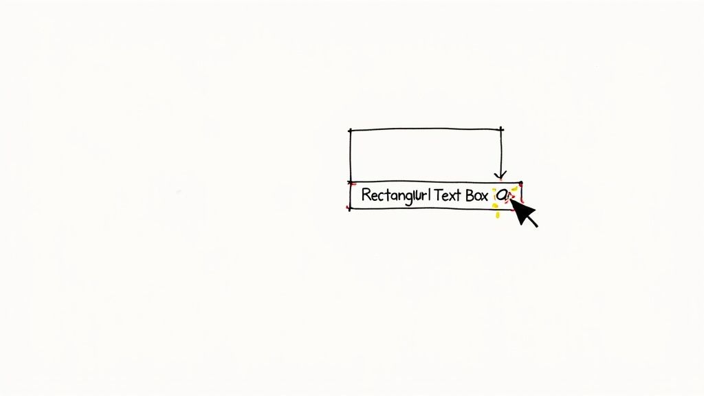
If you're looking for total creative control over your text boxes in Google Docs, the Drawing tool is where you want to be. Think of it as a dedicated mini-studio where you can build and style your box exactly how you want it before dropping it into your document.
To open it up, head to Insert > Drawing > +New in the main menu. This launches the Drawing window, a separate editor that serves as your creative canvas. While Google Docs lacks a direct "insert text box" button on the main toolbar, this drawing feature is the go-to method for anyone needing highly customized boxes with specific colors, borders, or other flair. You can find some more great insights on how text boxes function in Google Docs over at nira.com.
Creating Your First Box
Once you're inside the Drawing canvas, find the Text box icon in the toolbar—it looks like a 'T' inside a box. Click it, and your cursor will change into a crosshair. Now, just click and drag anywhere on the canvas to draw your box to whatever size you need.
Don’t sweat getting the dimensions perfect right away. You can easily click and drag the little blue handles on the corners and sides to resize it at any time.
Pro Tip: Want a perfect square? Hold down the Shift key while you drag. This locks the aspect ratio so you don't end up with an accidental rectangle.
With your box drawn, you can start typing immediately. Your text will automatically wrap to fit inside the boundaries you've set.
Formatting and Customization
This is where the Drawing tool really shines. When your text box is selected, a whole new set of formatting options will pop up in the toolbar, giving you fine-tuned control over its look and feel.
This is the Drawing tool's interface, where all the magic happens.
 Take a look at the toolbar at the top—that's your command center for fill colors, border styles, text alignment, and more.
You have a ton of options to play with here:
- Fill color: Change the background of your box to make it pop.
- Border color: Tweak the color of the outline itself.
- Border weight: Make the outline thicker or thinner for different visual effects.
- Border dash: Get creative with solid, dotted, or dashed lines.
Once you’re happy with how your box looks, just click the big blue "Save and Close" button. Your custom text box will instantly appear in your document, ready to be positioned wherever you need it.
The Single-Cell Table Trick for Ultimate Control
While the Drawing tool offers a lot of creative freedom, I’ve found there’s another powerful—and often overlooked—method for creating text boxes in Google Docs. It’s my secret weapon for unmatched stability and control: a simple single-cell table.
This technique is an absolute lifesaver, especially when you need your document to look perfect on mobile devices. I can't tell you how many times I've seen drawings become clunky or completely uneditable on a phone. By inserting a 1x1 table, you create a container for your text that behaves predictably within your document's flow. It's quick, effective, and delivers consistent results everywhere.
How to Format Your Table as a Text Box
Once you've dropped in your 1x1 table (Insert > Table > 1x1), you can easily make it look just like a text box. Just right-click anywhere inside the cell and choose Table properties. This opens up a handy sidebar with all the customization options you’ll need.
Here’s what I usually adjust to get the perfect look:
- Border Color and Thickness: You can change the border color to match your document's theme. My favorite trick? Set the thickness to 0 pt to make the border completely invisible.
- Cell Background Color: Adding a subtle background shade is a great way to make your text box pop off the page.
- Cell Padding: This is the most important setting. Adjusting the padding gives you precise control over the white space between your text and the border, something that’s far less intuitive with the Drawing tool.
This image breaks down the key settings you'll use to transform a plain table cell into a polished, functional text box.
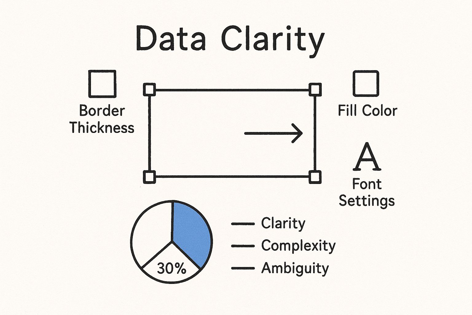
As you can see, a few quick tweaks to the border, color, and padding are all it takes to completely change its appearance.
The biggest advantage here is compatibility. A text box made from a table is fully editable on phones and tablets—a critical feature for any collaborative document that gets updated on the go. In my experience, drawings almost always lose this functionality on mobile.
By mastering this technique, you ensure your layouts stay intact and accessible, no matter how or where your audience views them. It’s a practical solution for anyone who values both form and function in their documents.
Drawing Tool vs Single-Cell Table Comparison
So, when should you use the Drawing tool versus the Table trick? Each has its place. I’ve found the Drawing tool is best for creative, free-form designs, while the table method is unbeatable for structure and consistency.
Here's a quick breakdown I've put together from my own experience:
| Feature | Drawing Tool Method | Single-Cell Table Method |
|---|---|---|
| Positioning | Free-floating: Can be placed anywhere on the page, even over other text. | In-line: Sits within the text flow like any other character or image. |
| Mobile Editing | Limited to non-existent; often appears as a static image on phones. | Fully editable: Text can be changed on any device, including phones and tablets. |
| Text Wrapping | Offers multiple text wrap options (in line, wrap text, break text). | Only offers the "in line" option; flows with the surrounding text. |
| Creative Shapes | Can be created in various shapes beyond a simple rectangle (circles, arrows, etc.). | Limited to a rectangle; cannot be shaped. |
| Ease of Use | More intuitive for visual, free-form placement. | Extremely simple for creating structured, in-line callouts. |
| Best For... | Eye-catching callouts, diagrams, and designs where exact placement is key. | Pull quotes, side notes, and any text that needs to remain stable and editable across all devices. |
Ultimately, the best method depends on what you're trying to achieve. For important documents that need to be professional and reliable, I almost always lean on the single-cell table. It's a simple, elegant solution that just works.
Once you've gotten the hang of creating basic text boxes in Google Docs, you're ready to dig into some more advanced tricks. These are the techniques that can really make your documents stand out, giving your layouts a polished, professional finish that grabs the reader's attention.
Let's head back to the Drawing tool. Instead of just picking a solid fill color, try applying a gradient background. You’ll find this right under the "Fill color" option. A subtle two-tone gradient, like a light gray fading into a clean white, can add a really modern sense of depth without being distracting. I like to pair this with a soft drop shadow, which you can add from the "Format options" menu, to make the text box look like it's floating just above the page. It's a fantastic effect for callouts or important quotes.
Creative Layouts and Layering
Don’t just think in single boxes. The Drawing tool is actually perfect for piecing together simple diagrams or flowcharts right inside your doc. After you’ve created a few text boxes, grab the connector lines (they look like curved or elbow-shaped lines) to link them together. This is a super practical way to visually map out a process without needing a separate app.
For a truly custom look, you can layer a semi-transparent text box over an image. First, place your image in the document. Then, open the Drawing tool to create your text box. Set the fill to a dark color like gray, and then click "Custom" to play with the transparency slider. When you place this semi-see-through box over your picture, it creates a sleek, magazine-style overlay that’s perfect for titles or captions.
My favorite trick for pull quotes is to use a single-cell table and only show one border. You can do this in the table properties by setting the top, right, and bottom borders to 0 pt while making the left border a thick, colorful line. It creates this stylish, minimalist look that really draws the eye.
Advanced Table Formatting
If you prefer the stability you get from using tables, you can still get creative by merging cells. For example, you could create a 2x2 table and then merge the top two cells. This gives you a nice header area with two distinct columns underneath for side-by-side text. It's a great setup for mini-infographics or feature comparisons. Playing with different background colors in each cell helps organize the information even more.
And for anyone on a Mac who's looking to speed up repetitive typing—especially when filling out multiple text boxes with the same info—you can utilize a Text Expander for Mac. This lets you insert common phrases or data points with just a quick shortcut, saving a ton of time.
Solving Common Text Box Frustrations

So, you’ve spent all this time getting your design just right, and then it happens. You add a single paragraph to your document, and suddenly your perfectly placed text boxes in Google Docs are scattered across the page. It's a classic, and incredibly common, frustration.
The culprit is almost always how your text box is anchored to the content around it. When you select a text box you made with the Drawing tool, a little menu pops up underneath it. This is where you tame the beast.
- In line: This option essentially treats your text box like a giant letter or character. It will move right along with the text, which is actually the most stable and predictable choice if you don't need text flowing around it.
- Wrap text: This is what most people want visually—it lets your main document text flow neatly around the box. But be warned, this is what causes the shifting when you add or delete text.
- Break text: This option pushes text above and below the box, creating a clean break but leaving the sides empty.
For those times when a layout absolutely, positively cannot move an inch, you need to lock it down.
Locking Your Layout
Once you have your text box positioned exactly where you want it, click "Wrap text" and then find the "Fix position on page" option in the dropdown menu. This is the magic button. It severs the box's connection to the text flow, anchoring it to that specific spot on the page itself.
Now you can type, edit, and rearrange your main document to your heart's content, and your carefully placed elements won't budge.
It's worth getting the hang of these quirks, especially since Google Docs is so widely used now. User habits are changing; many people, especially in Gen Z, use Docs for everything, even converting Word files. That makes knowing how to manage native features like text boxes in Google Docs a really practical skill. You can read more about these evolving user habits on SADA.com.
Another huge headache is trying to edit your work on a phone or tablet. Text boxes created with the Drawing tool often turn into static, uneditable images on mobile. It's a dead end. If you know you or your collaborators will need to make edits on the go, the single-cell table method we covered earlier is, by far, the better choice.
Frequently Asked Questions About Text Boxes
Even with a step-by-step guide, you might run into a few tricky situations when wrangling text boxes in Google Docs. I get it. Here are some quick answers to the questions I hear most often, designed to get you unstuck and back to work.
Can I Make a Text Box Transparent?
Yes, you absolutely can, and the right way to do it depends on how you created the box in the first place.
- For Drawing Tool Boxes: Just select the text box you made. In the toolbar that appears, find the Fill color option (it looks like a paint bucket) and choose Transparent. That's it—the background will become completely see-through.
- For Table-Based Boxes: This one takes an extra click. Right-click your single-cell table and go to Table properties. Under Cell background color, just set it to 'None' or white. To make the border vanish, find the Table border setting and change its color to white or set the thickness to 0 pt.
How Do I Curve Text Inside a Text Box?
This is a common question, but unfortunately, Google Docs doesn't have a built-in tool for warping or curving text inside a drawing or a table. Your text will always stay on a straight, horizontal line.
The best workaround? Create your curved text in an external design tool (like Canva or even Google Drawings in a separate tab), save it as an image, and then insert that image into your Doc.
One of the platform's key limitations is the lack of advanced text-shaping tools. For anything beyond basic formatting, creating a graphic in another program and importing it is the most reliable way to get a truly custom look.
Why Can I Not Edit My Text Box on My Phone?
This is a huge point of frustration for many, and it almost always comes down to one thing: you used the Drawing tool. Text boxes created with Insert > Drawing are treated like static images by the Google Docs mobile app, which makes them difficult or impossible to edit on the go.
For any document you plan to edit on your phone or tablet, the single-cell table method is far more reliable. Tables are fully editable across all devices, ensuring you can make changes wherever you are.
Tired of jumping between apps to get work done? Tooling Studio builds powerful Chrome extensions that bring your workflow directly into Google Workspace. Manage tasks with Kanban boards and track sales with a lightweight CRM without ever leaving your inbox. See how we can boost your team's productivity at https://tooling.studio.